Gregory sent me an email yesterday that I thought would lend itself to a good discussion:
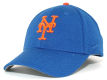
A lot of people will think, and rightly so, that this is a totally meaningless question, but I am curious. I’d like to know, what’s up with the blue the Mets use in their uniforms? Â They say it’s Dodger blue, but it’s not. My mom saw a Mets hat on me recently and said it looked like electric blue. It does, especially with that orange. It’s definitely lighter than Dodger blue. It’s not a very becoming blue, and it looks even worse when coupled with civilian clothes.
Who chose it, and why? Was it just an accident? Did someone think it looked good? What shade of blue is it? Does it have some symbolism? Was it just to be different from the Dodgers? Did they get an order on some cheap blue tint and stick with it? I’m inclined to guess it was just an accident which has been upheld as tradition, out of inertia.
I figured you would know the answer to this, if anyone would, or you would know how to get it.
For a team challenged with having to combine blue with orange, they pick shockingly clashing versions of each, and then pinstripes, and dropshadows. What a noisy uniform.
It’s funny this came up. Â During the week I was asking Osh41 if I was right when I think the current Mets blue is darker than that of the late 70s. Â Â Let’s take a look at several photos:
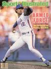
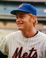
One thing we must consider is the lighting and other stuff I don’t know about in all the photos. Â To try to have some measure of consistency I thought I’d look at some Sports Illustrated covers, assuming they have some sort of consistent quality control.
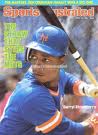
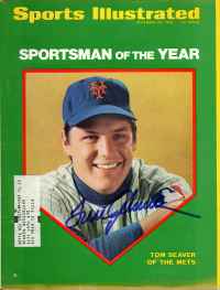
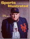
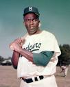
In the bottom row is Casey Stengel. Â That blue has always struck me as dark. Â Pictures from that era always make the Mets look dark, but maybe it’s just the quality of film from the period.
Compare Casey to Seaver and Strawberry. Â Seaver looks lighter than Casey and Darryl looks lighter than Seaver.
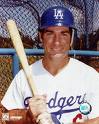
Is Jackie Robinson’s blue the same as Steve Garvey’s? Â Jackie’s looks darker. Â Again, is it the photography?
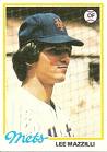
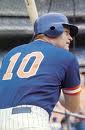
How about the shots of Rusty in the 70’s and 80’s? Â The 70’s look lighter to me. Â Comparing both to David Wright, the modern blue looks darker than either.
If you flip through the MLB Style Guide, the blue on the 1974-77 road jerseys is clearly lighter.
From Mets.com
November 16, 1961 – The circular Mets logo, designed by sports cartoonist Ray Gatto, was unveiled. It has gone virtually unchanged throughout the history of the club. The shape of the insignia, with its orange stitching, represents a baseball, and the bridge in the foreground symbolizes that the Mets, in bringing back the National League to New York, represent all five boroughs. It’s not just a skyline in the background, but has a special meaning. At the left is a church spire, symbolic of Brooklyn, the borough of churches. The second building from the left is the Williamsburg Savings Bank, the tallest building in Brooklyn. Next is the Woolworth Building. After a general skyline view of midtown comes the Empire State Building. At the far right is the United Nations Building. The Mets’ colors are Dodger blue and Giant orange, symbolic of the return of National League baseball to New York after the Dodgers and Giants moved to California. Blue and Orange are also the official colors of New York State.
I love highlighting that black is not mentioned as an official color.
This article from 1961 mentions “royal blue”
$3.95 – New York Times – Nov 17, 1961
The New York Mets have struck it rich, and they are sharing the wealth. … The insigne done in orange and royal blue, official colors of the new club, …
Here’s a fun one..I often refer to the Mets looking like a softball team. Â Here’s Casey talking about the A’s switching to green:
Miami News – Google News Archive – Feb 4, 1963
bet that the Mets will and dignified white,” he was rumored as saying. don’t have to wear gay colors to look like a softball team.” . …
I’m sure this will generate comments. Â As for me, I remember ’70s blue to be lighter. Â Thoughts?
I always loved that shade of blue on the SI cover. I really don’t like it when it’s too light. I collect hats, mostly Mets and Brooklyn Dodgers. To be honest, no one knows what Dodger blue is. It changed a lot back in the day and the current Dodger blue is different than that of the Brooklyn Blue. The Mets blue is different from both of those as well. I’d say the Mets blue is in honor of the Dodgers and not Dodger blue. If you look at the Giants and Dodogers history in NY, both teams colors changed A LOT as well as their logos. The Mets adding black kinda falls into that tradition. Brooklyn went green once and the Giants were red white and blue. As much as I dislike the black being added, I just see it as more of an homage to the giants than a marketing scheme. Well ok…I’ll just choose to believe that. 🙂 Oh Shannon, do you have a date when the Mets NY changed and why? The current one is a lot more curvy than the older one. Thanks
I don’t. The evolution of the NY would be a good rainy day post!
The Dodger green is when you see it. Both the Dodgers and the Giants locked in what we think of their “traditional” colors fairly late.
Somewhere back in time one of my ancestors probably wrote a newsletter complaining that the Giants switched to black.
I thought that I was the only one who actually noticed the difference between Mets Blue and Dodgers Blue…THere is a huge difference. If the Mets could just stick to reality and go back to their origins in terms of colors and tradition, this franchise would be taking a step in the right direction. Ban the HYBRID Fitted!!! At all COSTS!!!
The original Met blue was darker than the color they use now. I think it was as close to Dodger blue as they could come at the time. They stuck with that color right through the 1986 season. They went with a lighter tone for 1987, but wore those new lighter caps in the post season. If you take a good look at pictures from the playoffs and Series that year, the hats are clearly a lighter tone than the sleeves. They changed back to a darker blue in 1993 when they went with Mets with a tail across the chest. I remember a story about the new uniforms in that year’s Yearbook and they claim the caps were “one pantone darker” and back to the traditional Mets blue. I’m not sure if the blue got lighter again in ’95 when they added the orange button, but it looks like they might have.
Sorry, In reading my comment, I think I wasn’t clear — I meant they went with the lighter caps in the post season of ’86!
Here’s something to chew on: notice how Rusty’s cap is so much lighter than the “Mets” lettering on his jersey.
The color has definitely seemed to change over the decades, but in addition to lighting and film discrepancies, could it be that the different material composition of caps over the years has had an influence?
Well, as a Mets fan who has lived in Los Angeles since 1967, there is definitely a difference between Dodger blue, and Met blue. There always has been. Dodger blue is darker.
Jim, How do you follow the team? Do you have MLB.tv? DO you like 4:10 starts? Do you also follow the Dodgers or go to games?
I’m thinking the blue and orange are taken from the NYS flag. See the flag on Wikipedia. It is that light blue in question.
As for Dodger blue, has it really changed over time? I’m not so sure about that.
About blue in photographs, I had to restore some old (1970s) color photos recently, and the blue had leached out of almost all of them. Photoshop was how I instantly restored those photos, putting heavy doses of blue back in. Hence, photos you might see, whether in old magazines, or represented in new ones, cannot be solidly relied on, imo.
I think the cure for the Mets image is simple, and could still pull in some extra bucks by having ‘consumer options’.
Simplify the uniform. No black. Darken the blue, to current Dodger/Royals blue. (Royals were the old Bklyn farm team.) Then, offer two versions of their hat, one with the orange insignia and pin, and one with them white. If they really wanted a third, they could offer a ‘throwback’ version, to some early NY Giants varient, with orange on white felt, and the old insignia. Vini, vidi, vici.
Agreed! Ban the Hybrid. Simplify and go with a simple look. Kill the black drop shadow.
I’m still thinking about this thread.
It isn’t just a question of lighter or darker blue. When you think about a color blue, you’ll find that it sometimes has hints of the other primary colors in there. This is true for Dodger blue. The old Red Sox red had a hint of yellow in it. (The new one doesn’t.) Yankees midnight navy blue has hints of the other primary colors as well, to simulate black within the blue.
For the Mets, I could swear I see a tint of green under certain lighting, and it creeps me out.