 A reader request from Christopher:
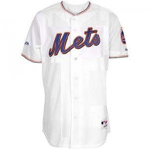
Hey Shannon, Big fan….listen, I love all the possible combinations of uni’s for next year…and the white one you have with the different kind of piping around the neck and arms is awesome!!!! It’s perfect, except if it was cream colored, I think it would be the perfect combination. Could you ask someone to possibly create a photo of what that might look like and post it??? I am positive it would look insane with the blue hats.
Laurence, you made the jersey depicted here – think you can cream it?
I had been laying off the unis thing for a few days but tonight’s hybrid caps with black undershirt are getting me cranky. Â I can almost sort of perhaps understand the marketing of the black jerseys, but I don’t understand the black undershirts.
I’m really done with the everyone-wears-42. Â Let one player do it and tell his story of why it is important to him.

That jersey in cream would look like the SF Giants.
I’ve said it before and I’ll say it again, the Mets perfected the Jersey back in ’86. Anything they do other than that is just not going to stack up.
I know that the Mets won it all in that jersey, but aside from that, those racing stripe jerseys are just as ugly as the Houston Astros ones from the same time period.
Perhaps the rationale of wearing black undershirts is that they match the black in the cap. If they were wearing blue caps, they would have worn blue undershirts (and socks too).
I believe John Franco is to blame for the whole black t-shirts,belts, socks thing
Yep. For picture day in ’98, the team wore their then-new hybrid caps with their then-newly-drop-shadowed white unis. Franco wondered aloud why the caps turned black but the belts and shoes stayed blue, when the other stuff traditionally matches the cap.
I can respect Franco’s sentiment in support of the standard baseball color scheme, but Samuels should’ve just told him “Because the bill and logo are still blue, that’s why.”
didn’t franco wear the orange sanitation shirt all the time in honor of his dad?
Don’t really like the jersey that much either. If they get rid of the dropshadow maybe. Like you Shannon, the wearing of the Hybrid fitted is driving me insane. I was hoping that they would finally not wear it at home. Too Bad….as usual.
@elprimo yeah the hybrid annoyed me last night.
Kinda busy with Real Job today but heading to Citi later
Looks like PJs top your girlfriend would wear to bed.
There’s no pinstripes. They have enough uni’s with no pinstripes and the piping is too Giants.
The Mets should do something flat out and plain and simple. Return to the look they had in the 60s and drop black entirely. I would love to see the blue hat and 2 jerseys, one creme colored and one grey, no black.