On twitter during most games a discussion breaks out about the score bug.
On the 2012 version, SNY has chosen to place the inning between the two teams’ scores. The result: the number in the middle makes folks (like me) read the inning as one of the scores. Look at the circle in red.
Also the strikes are indicated by RED dots. I often think there are 2 outs when there are 2 strikes. Look at the circle in yellow.

Yes that’s Peyton Manning but that’s beside the point.
Clearly the scorebug can be easily fixed.
Thought it was just me being uber-picky. I’ve been having the same issues — at first it drove me nutty, now it’s at the point of aggravation because I can’t imagine why they thought any of this was a good idea. Plus, I don’t ever want dots for the balls/strikes — I want the numbers, please. But my biggest gripe is the inning info. Move it. I’m continually reading it as the score. I ask for very little in life. #fixthescorebug
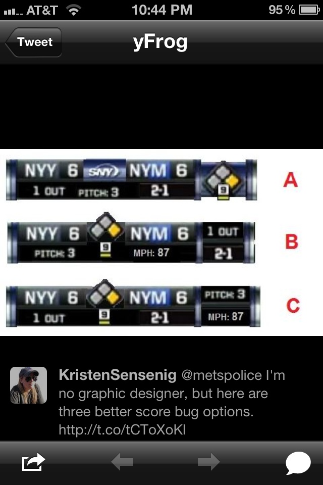
Agreed. So many people that I know have no idea what’s going on with the score module, I’m used to it at this point though. I think I like option (C) the best. Though, when I think of a baseball score, I think “Score, Inning, Base Runners, Count”. So with the score on top, it would be great to have the rest of that in order from left to right.
On a separate note, during all SNY/PIX11 broadcasts, they are still using the OLD Mets HYBRID logo (Blue NY Insignia, Orange outline on Black Background). They should get with the program and go Orange NY Insignia on Blue Background.
LGM!
Glad to see that I’m not the only one who had issues with this new TV score box. It threw me off a number of times.
I didn’t even know there was any concern with it until you mentioned it. always seemed fine to me. I guess I get what you mean about the inning/score. change the font and color would fix that too. or just write it as bot 5 or top 5.
I think I’ll eventually adjust to the red dots, but the inning number messes me up every time.
Snigh Police!
Kristen – i am a Yankee fan, but like to watch Mets sometimes. The SNY scoreboard graphic is ReTarded. Someone needs to be fired – seriously. All 3 of your options are a great improvement over the current mind-F that disgraces channel 718.
Ceetar – do u have 3 eyeballs?
I’m glad someone addressed. Those options are much better than the current one. I am a designer and had another option to throw into the mix.
It’s clear the graphics department over there doesn’t have a sense of hierarchy. Having said that, they may have been forced to go with that design against their own suggestions. It happens all of the time. You design something that makes sense and then someone (who doesn’t know what they are doing) gets involved and complicates things. (see the client)