Last week, as part of Hypocrites Week (I wore black in support of the no longer boycotters stop calling it that it was never a boycott even though they are now taking credit for the Mets starting hot with players they said were bad signings I digress.
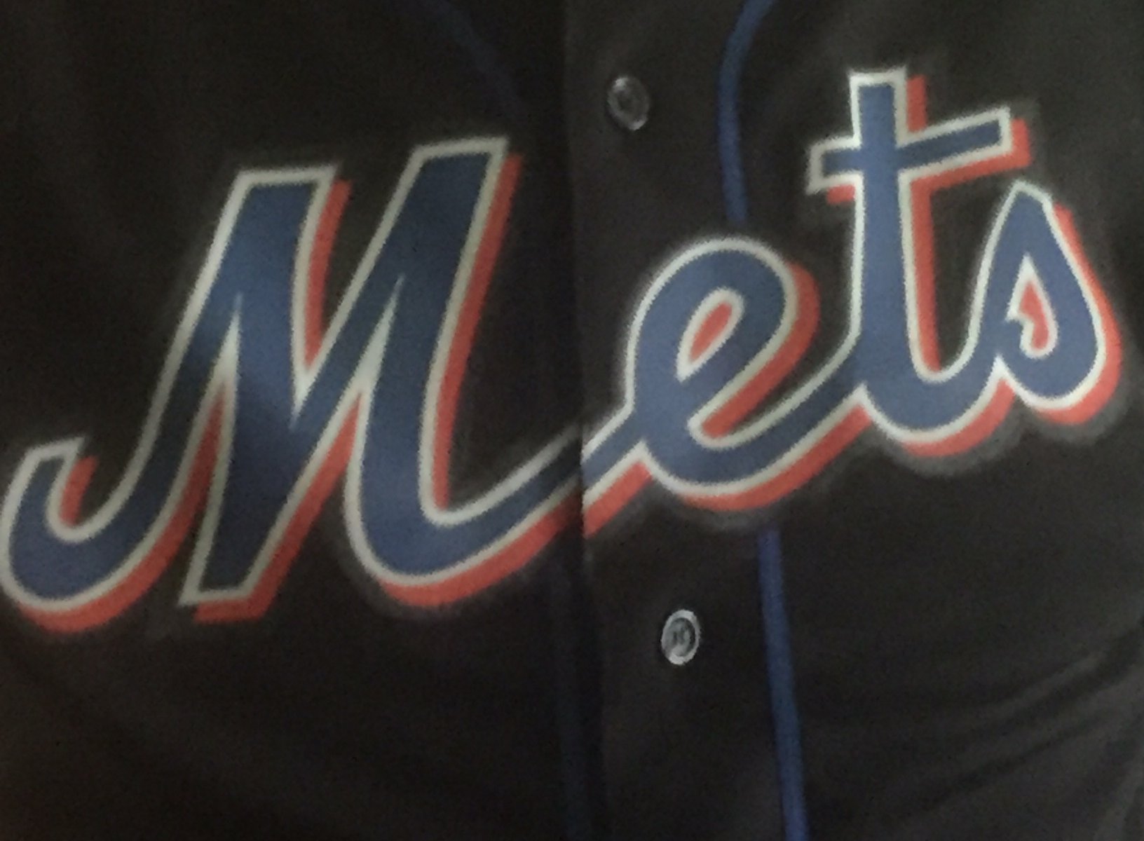
Last week, as part of Hypocrites Week I busted out this black jersey. I looked in the mirror. Aside form all the other reasons that was a bad idea, yuck look at the color of the jersey, boy you really let yourself go this winter, what caught my eye was the tail on the M.
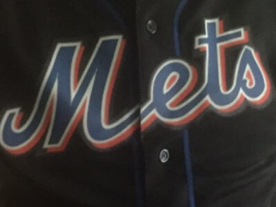
I mean yuck. Look how long the tail is, and it’s not just because my fatness has the buttons popping.
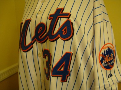
Here’s a ike Pelfrey jersey I have in the images from August 2010
I mean look at the tailllllllll on the M. WTF Charlie Samuels?
Fortunately in the Kierst era (all hail) the uniform look has been cleaned up and now we have a proper tail on the M.