What Mets fans talk about when not talking about the actual games.
Author: Shannon Shark @metspolice
Shannon Shark is the founder of MetsPolice.com, tweets as @metspolice, is an avid fan of Lee Mazzilli and Daniel Murphy, hates black uniforms and is the author of "Send The Beer Guy" available at Amazon.com. #imwith28
I haven’t checked out what The T-Shirt Guy is up to lately.
This cap is likely wayyyyy better than anything this City Connect stuff is going to be. First of all, it’s the correct colors. I like it. Maybe @mediagoon will get me one.
This QUEENS 39Thirty® Original Fit stretch fit cap features an embroidered design on the front, a stitched New Era® flag at wearer’s left side, Mets skyline logo on the right side, and The 7 Line’s T7L logo on the back.
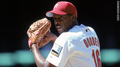
The issue here is that the Wilpons Mets dropped the ball on all this stuff. Gooden’s number shoudl have been retired, I dunno, in 2005 or so. And Keith, And Gary (still not done, because you can’t drive an event around a ghost), and the others. But hey they waited until Seaver died to put up a statue.
Steve has done the right thing playing catch-up, but baseball is dead now (even if the baseball mafia won’t admit it). Nobody cares. The people, like me, who grew up on this stuff have gray hair now and can’t be bothered to spend all that money and watch boring 21st century baseball. The younger folks are running polls asking if deGrom was better than Gooden, which is just absurd (even if someone who should know better as he was around in the 80s floated that a few years back). The younglings don’t know how exciting Gooden was, and they will never understand it. So they don’t want to attend this either.
So let’s take a look at social media and the ticket websites which makes me think they are heading for an underwhelming event.
UPDATE: It was brought to my attention that Gooden Day is Sunday not Saturday. Here are seat availabilities as of 3:12pm on 4/10
The Mets shared a teaser for the City Connect jerseys. Note the use of the Queensboro Bridge and the purple NY.
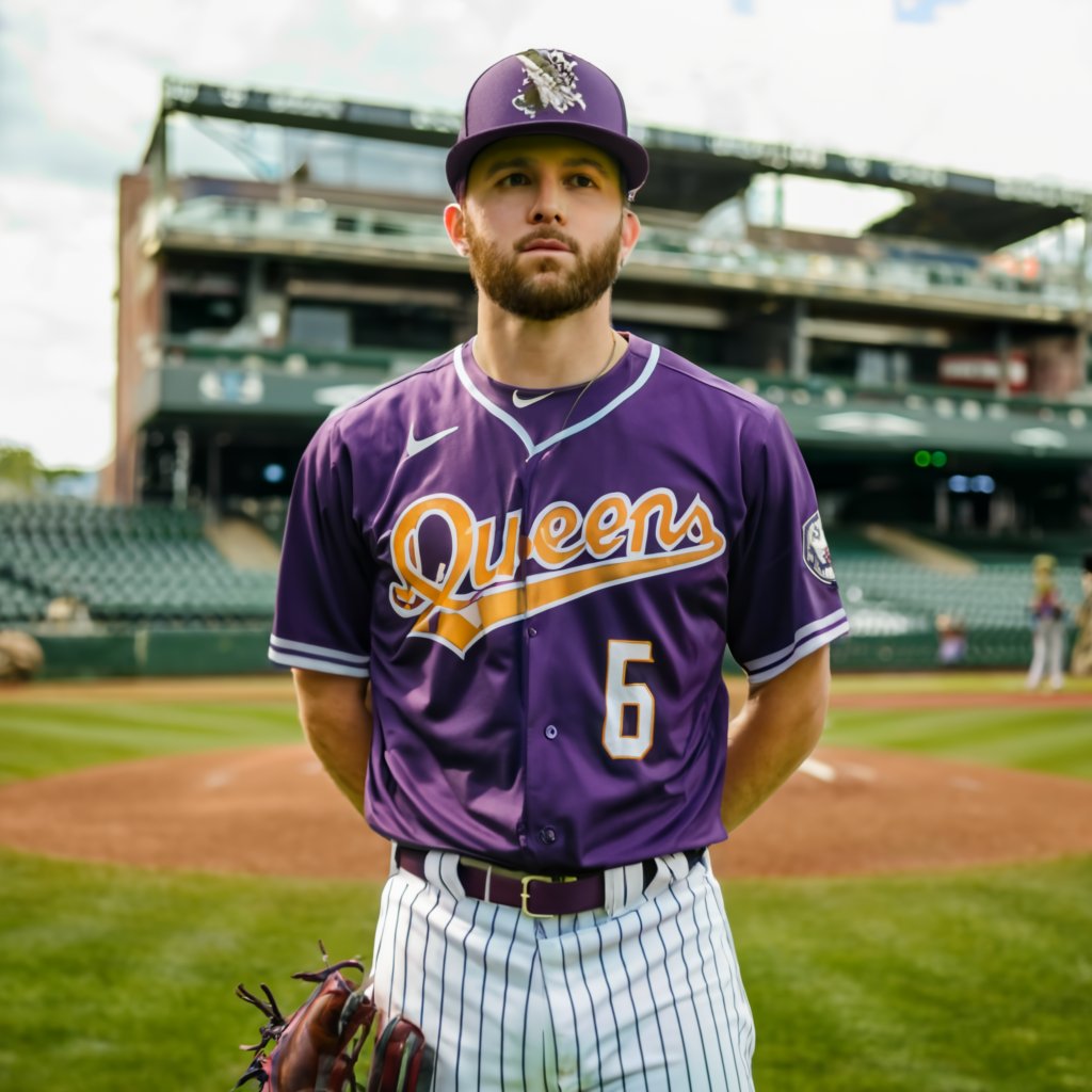
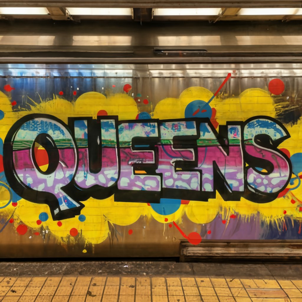
For years I have been goofing that the Mets City Connect jersey will be awful, joking that they will probably lean in on the Queens part and go with a subway graffiti font.
Well look at the purple. That’s a 7 train purple. (Maybe they just want to sell 850 of these to t-shirt enthusiasts)
And what do we think of when we think of subways in Queens?
GRAFFITTI.
Are these maniacs going to hang in purple jerseys (which MIGHT be ok) but with QUEENS in graffiti font? Oof.
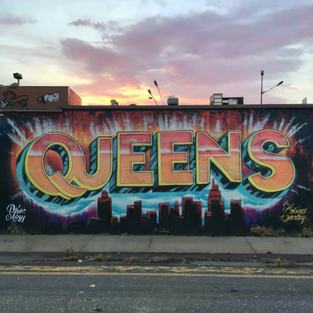
Something like this wouldn’t be atrocious (again here at Mets Police we think they should just wear the 2012 set forever.)
This was AI generated
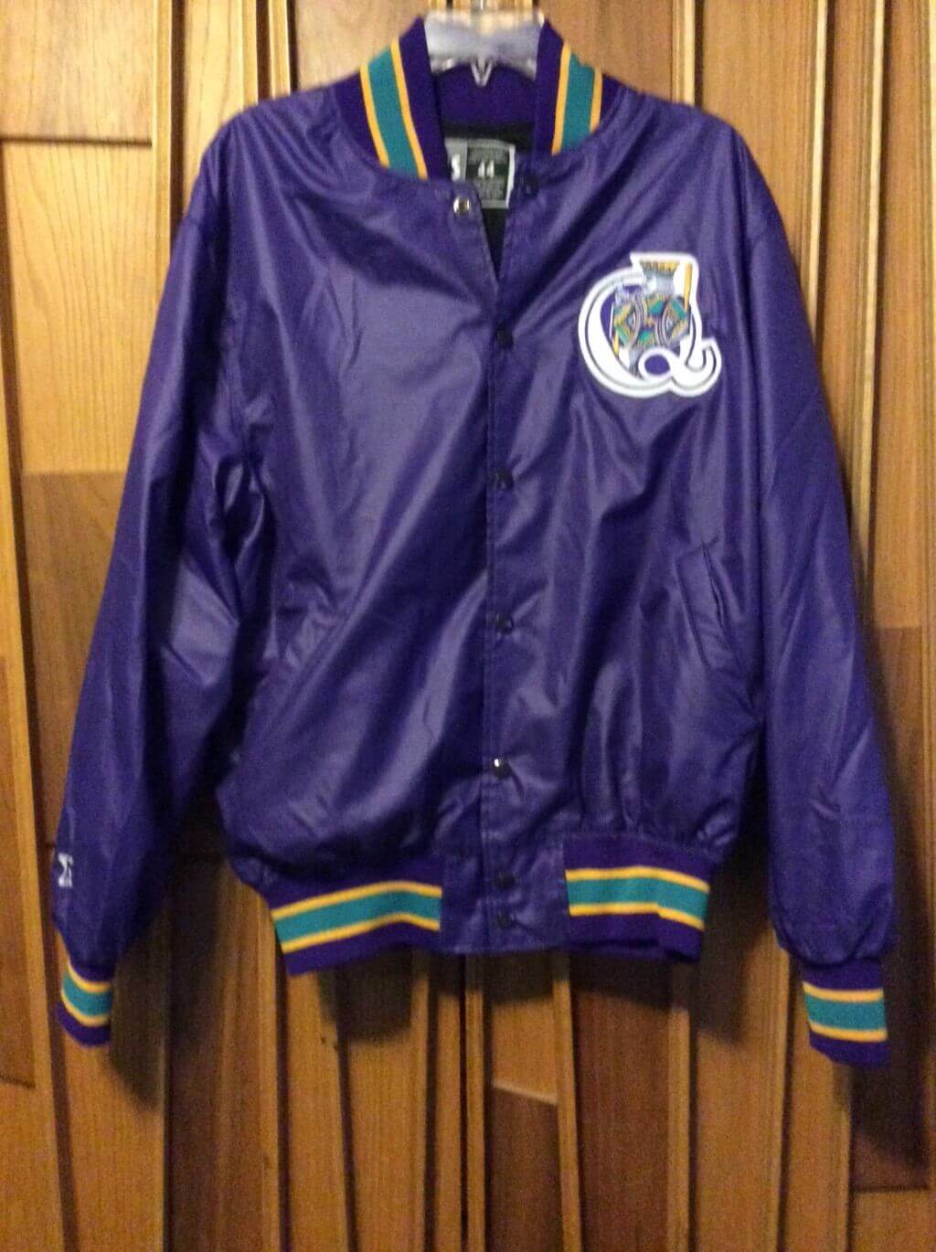
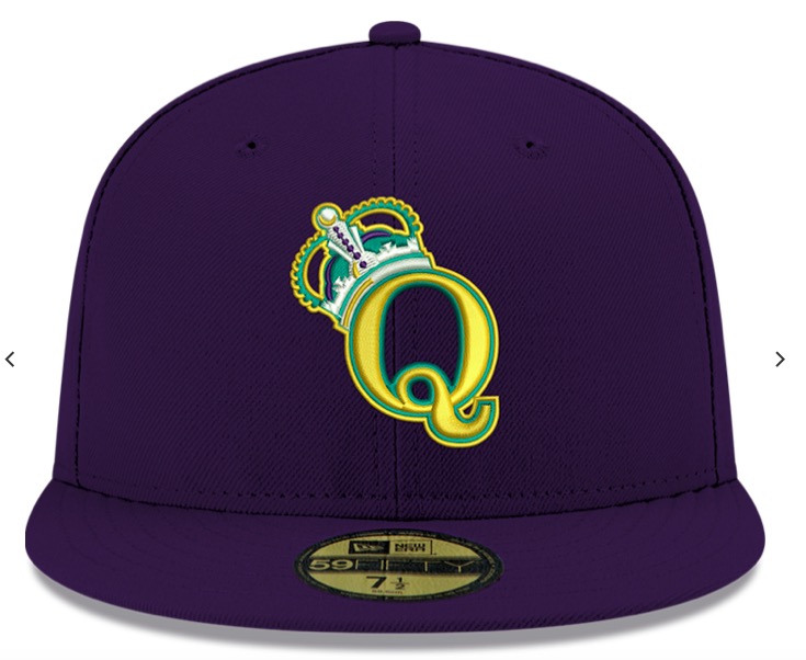
And don’t forget the Queens Kings already did purple/Queens motif…
This is an actual Queens King jacket.This is a Queens King cap, they were a real team.
So none of that is AWFUL, it’s not great but it’s not awful…..but what if we add GRAFFITI FONT
I can’t get the AI to generate graffiti font on a jersey but use your imagination.
I also don’t think this post below is crazy, as one of the reasons for the change in the black jersey was to match the black cap which was to match the city connect jersey. So maybe something like this isn’t off the mark….
Another clue might be the white lettering in this teaser…let’s look again
That could be some legally distinct “Subway” font.
I don’t think MLB/Mets/Fanatics/Nike/The Communist Government would spend the money to have “subway circle” custom numbers for everyone.
Also, the more I think about it, maybe Graffiti Font is hard to execute on a jersey? Easier to do individual block style letters?
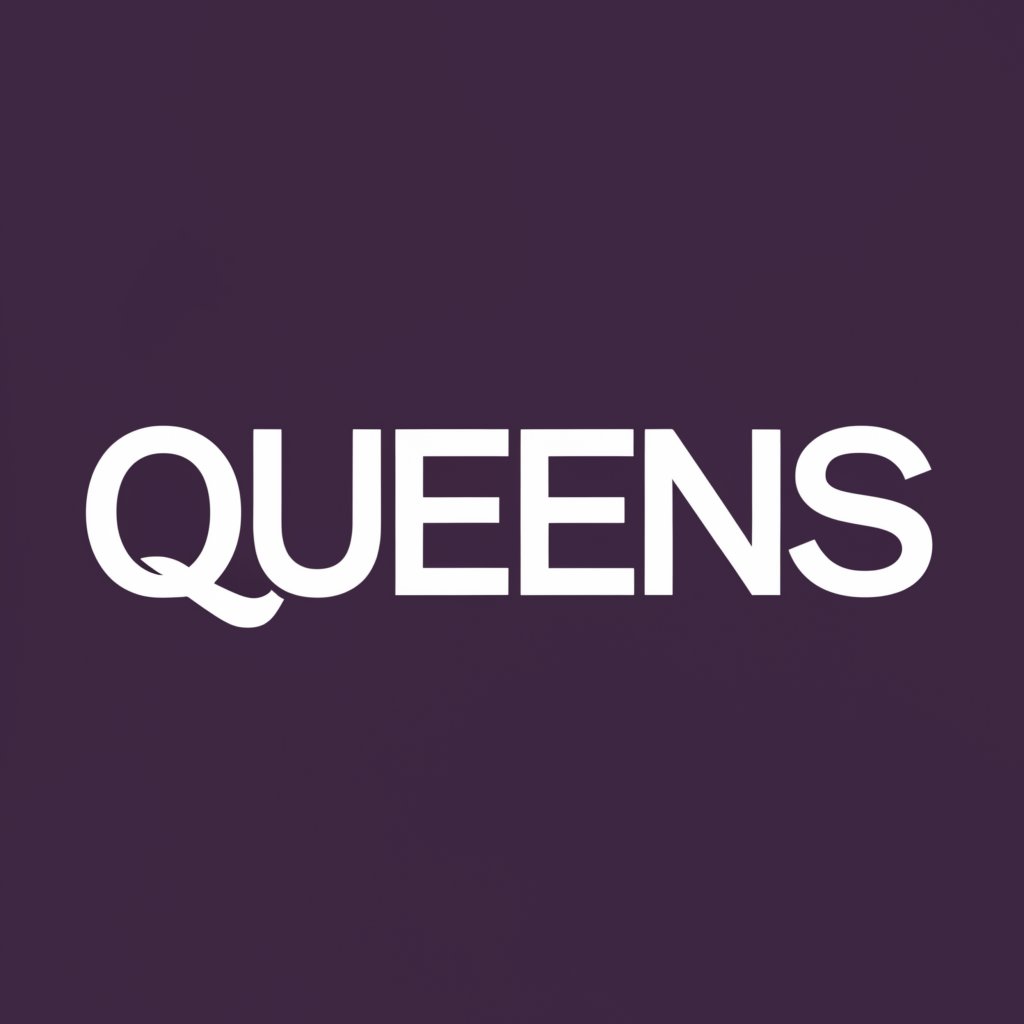
I’m also not sure anyone looks at Subway Font and thinks…cool. I think it would wind up looking something like this, but purple
AI won’t generate it for me, but the end goal would be QUEENS in white helvitica (or legally distinct similar) font
The MTA sells these…not sure that white subway font is all that exciting.
I think the Mets should wear this on Friday night.
It’s amazing that they somehow made the black jerseys even worse. The orange and blue give off purple vibes…and everything is going to be hard to see if you’re more than 6 inches away.
This website uses cookies so that we can provide you with the best user experience possible. Cookie information is stored in your browser and performs functions such as recognising you when you return to our website and helping our team to understand which sections of the website you find most interesting and useful.
Strictly Necessary Cookies
Strictly Necessary Cookie should be enabled at all times so that we can save your preferences for cookie settings.
If you disable this cookie, we will not be able to save your preferences. This means that every time you visit this website you will need to enable or disable cookies again.