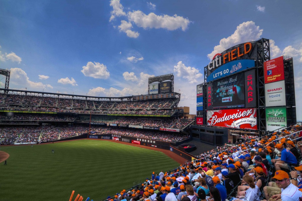
The beautiful photo below was posted this morning on Mets Blog and was taken by Michael Baron who runs Mets Photos (a great site with awesome Mets related pictures). Â It really caught my eye. Â Take a look at it, then let’s discuss it. Â (Click on it for a bigger view).
That’s a great looking shot. Â (Thanks Michael for letting me borrow it. Â I’ll return the favor with one of my crooked blurry iphone shots of a guy wearing a Shinjo jersey).
It looks like a warm place. Â A place filled with Mets fans.
Why does it look so good?
As you scan the photo three colors catch your eye. Â Orange, blue and white. Â The three colors that the franchise chose when they got it right the first time in 1962.
Next year is the 50th season of Mets baseball. Â It’s a perfect excuse to return to the classic look and classic color scheme. Â You can wear the dopey black crap on Mike Piazza Day and Edgardo Alfonzo day.
Sell whatever you want to civilians. Â Hell, I bought a GREEN jersey this week, it doesn’t mean the Mets should wear them.
I believe in Orange and Blue. Â Do the Wilpons?


I believe in the orange and blue. the fans in the stands all look good with that, but the outfield wall still looks out of place. maybe you found the missing link – ORANGE. could someone try to photoshop orange as the dominant color on the outfield wall?
And we believe in the orange and blue in you!
I did, and Shannon posted it a while back. It’s on here somewhere!
hallelujah, shannon! the orange caps came through on the telecast too. looking around in the stands and being struck by blue and orange was a welcome sight. let’s keep up the good fight!
Sorry, love the black (and still believe it should have been an original color). Lost in pins & blue yesterday, look to win with black today.
The orange looks sick in thay picture. Very vibrant.
i was at the game today.there seemed to be a lot more blue then hybrids. even tons of the orange from yesterday too.
Does look nice……..just need something around the apple (Shannon cmon ask the Mets why its so dull and what happened to the green turf…lol)and of course a dark blue outfield wall.
Need Better placement of flag pole too. Rightfield its lost and too small.
Geez I’m never happy…….lol.
Jesse I will ask about the turf next time I’m chatting with the Mets about something. Nothing planned right now.
I sat next to the apple a few weeks ago. The green turn was painted black. I would be nice if it were natural grass out there like in texas or St. Louis.
must’ve been a batters eye issue. I can’t imagine why they would’ve changed it so suddenly a week before the 2009 season started.