Was on Youtube for some stuff and watched a video and then MY EYES STARTING BURNING.
I mean, YUCK. How did this possibly get approved. We know all about the Uni Watch Oral History Of How The Mets Got Black Uniforms Seriously Read This Link Right Now but if the story is that “marketing” wanted black, did “marketing” really really suck at image making?
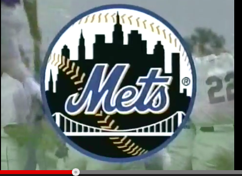
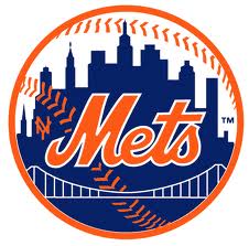
This looks terrible. It robs the original of all the charm. You had this awesome blue and orange that POPS and you settle for this drab crap?
Just terrible.
And a reminder of how bad the color scheme could look on things…
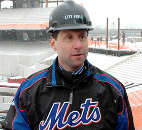
That’s an ugly jacket. The apparent colors look all over the place even if they scientifically match. Just a total mess.
Compare it to the jacket below. Clean. Classic.
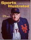
And for the love of Casey can we put the NY back where it belongs. I don’t buy into the story that it’s hard to reproduce. It’s reproduced below.
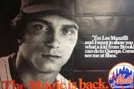
And it was reproducible in the 1980s. Oh, and marketing – that campaign used black. Looks a million times better than the dumb ball.