UPDATE: I will have much more on this subject tomorrow. Several things in today’s original post were incorrect – these are the 2011 BPs not 2012 Spring. More tomorrow with a lot more pics.
I was working on something else and stumbled across this image.
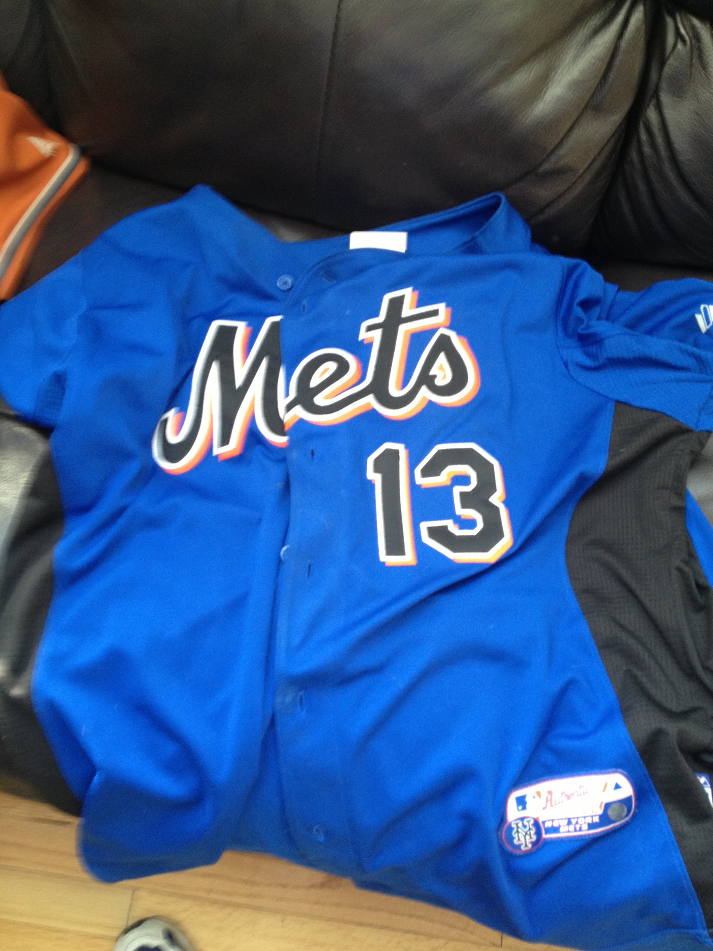
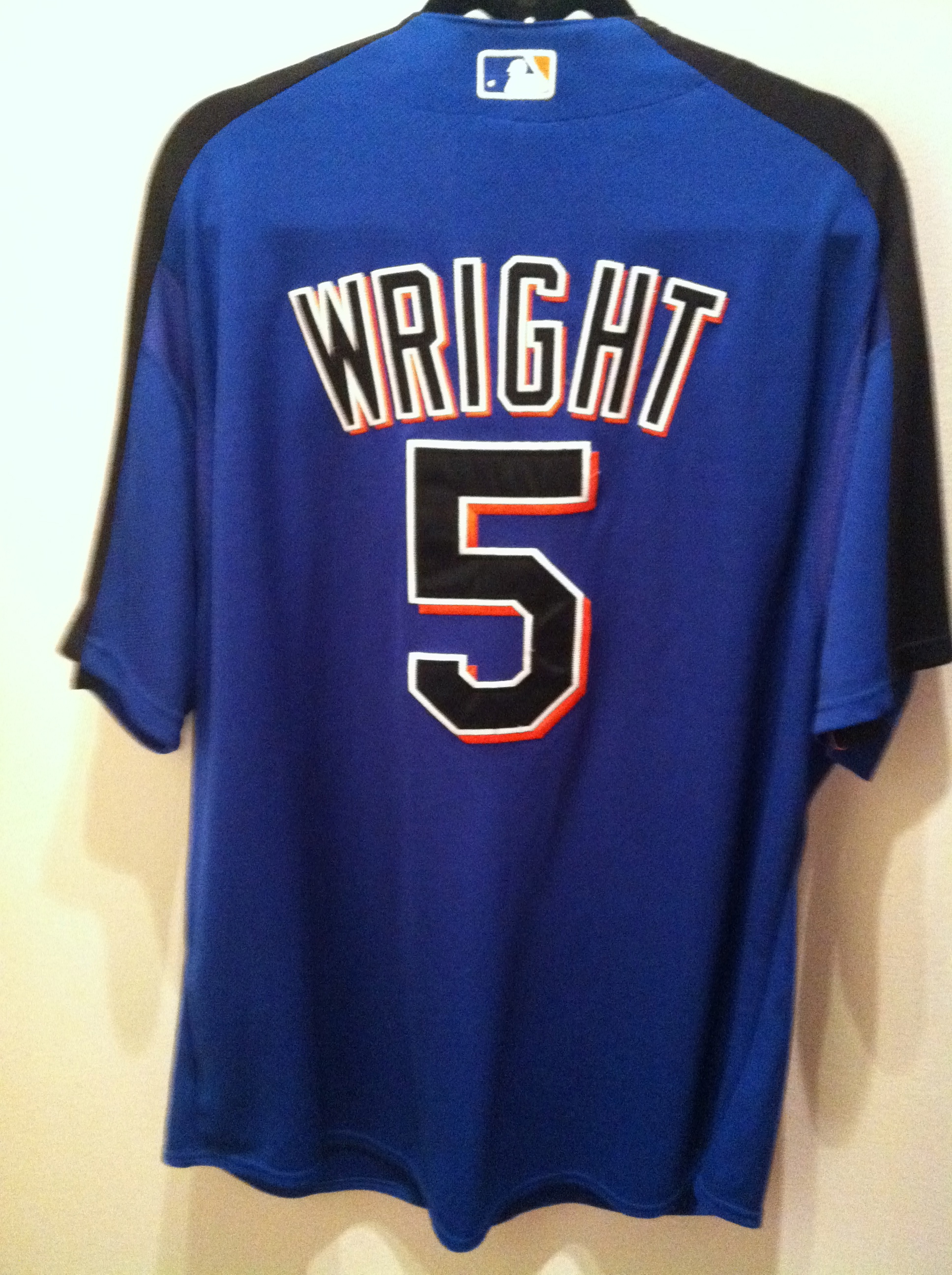
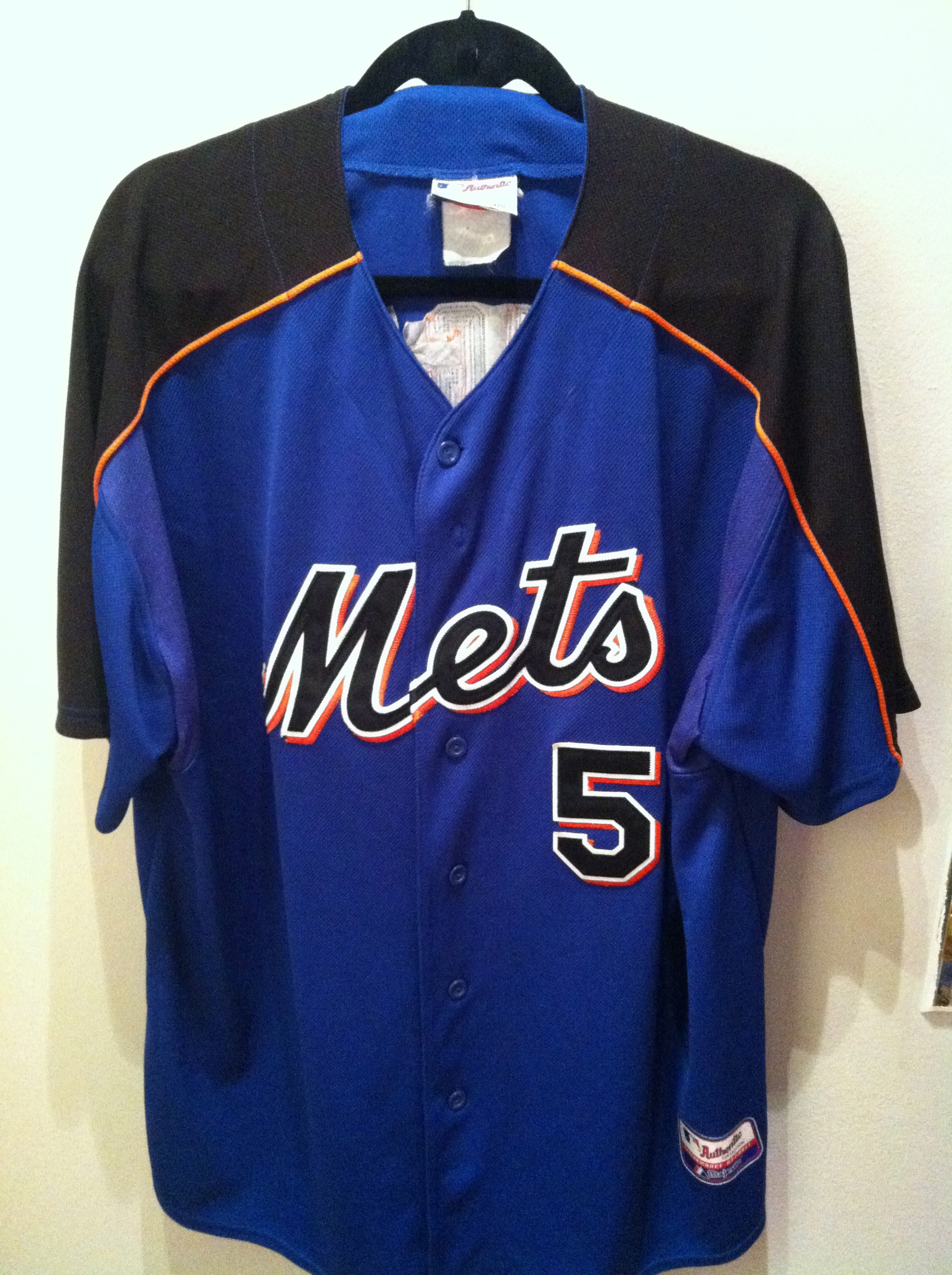
I feel like there is something to this. I actually like the way the black lettering looks on the blue.
What I don’t like (at all) is the side-paneling. Remember for a few years all the spring stuff had that side panel nonsense?
Now for whatever reason, I don’t have any shots of any Mets in there – nor do I have a picture of the cap properly labeled. I’m sure I own one, but am too lazy to go digging through the closet.
As common as blue stuff is now, back then I was happy to have anything blue, so I bought that #13 jersey for myself and I am glad I did.
Do you like these designs? I wouldn’t mind seeing them again, with no side panels, some spring.
Anyone got any pics of actual Mets in these?