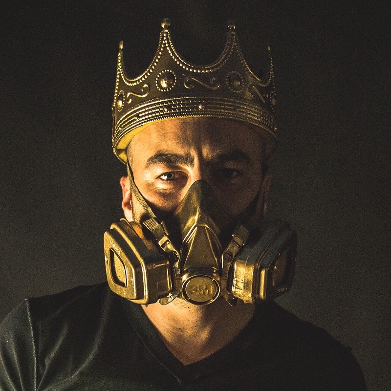
Topps is doing this really cool Project 2020 set which you’ve seen me write about a few times. They were cool and hooked me up with Blake Jamieson, artist for the Nolan Ryan Mets card, who answered a few questions.
My apologies to Blake and Topps as it took me about a week longer than I had hoped to spin this into a post, but I have been super duper busy with my actual job and a post like this takes a little more time to spin up as opposed to me ripping something off about a cap.
Much thanks to Blake for his time and for sending the extra images.
Can you talk about the project in general and what excites you about it?
It’s crazy how life works. A few days before Topps reached out to me about Project 2020, I was telling a good friend how I’d really love to work with Topps, because I’d seen another artist collaboration and thought it could be a good fit with my style of art. So when they emailed me a few days late, I was thrilled.
I love that all 20 artists are working from the same 20 original cards. I can’t wait to see how different each of the cards are. I am already really impressed with the work of the other artists who have already had card releases. It’s also fun to see cards from artists I already followed or was friends with (King Saladeen, Gregory Siff)
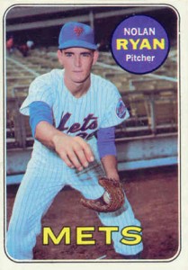
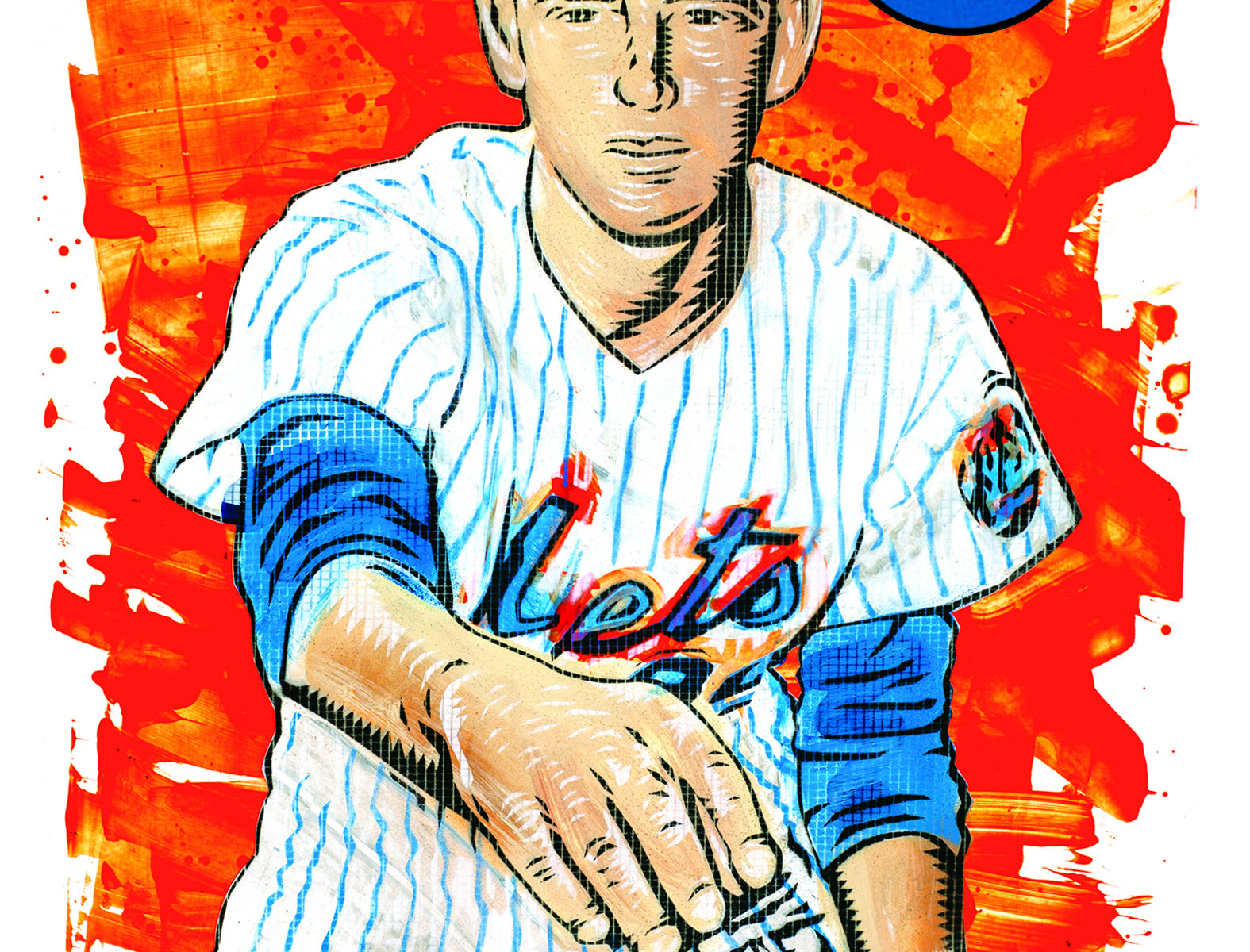
I went back and looked at the original card – clearly a card from another era – but wow the original is pretty boring and yours comes to life. Can you talk about your approach to color, I think the orange works really well in making this card pop.
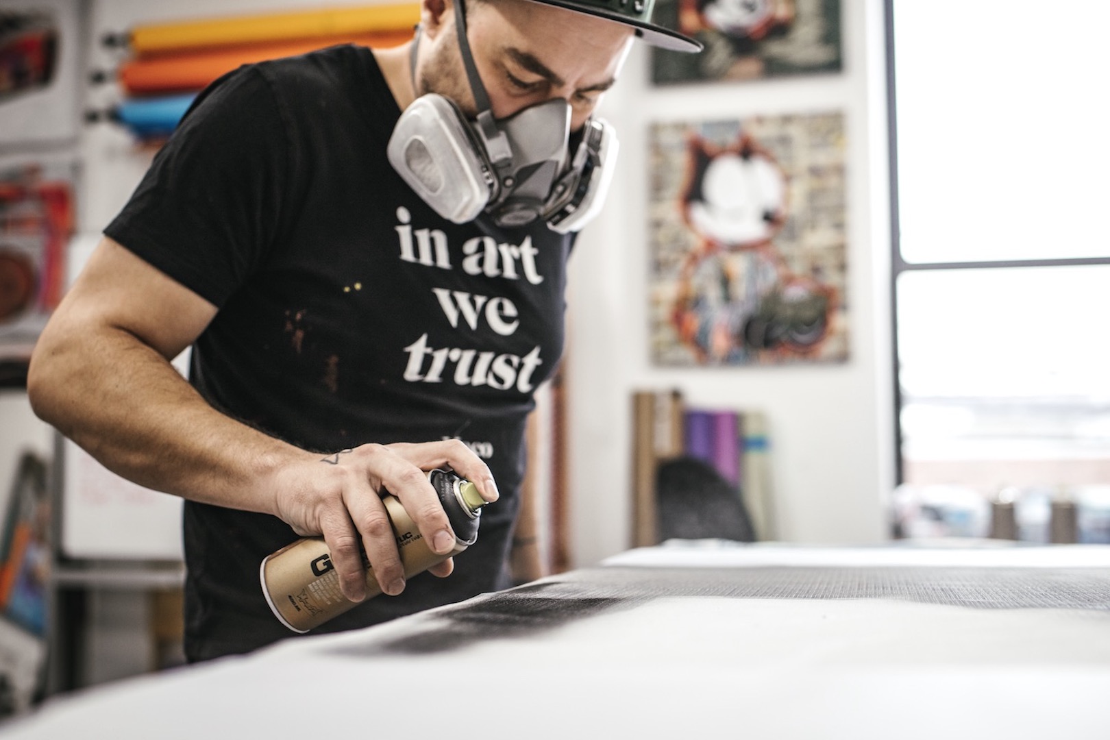
Thank you! I love working with bright colors. I use oranges and yellows more than most other colors because I really think it helps the portraits pop, like you mentioned. It was a natural fit to use bright orange because of the Mets logo and colors. I also want to make sure my 20 cards are recognizable as my art, so you will be seeing a lot more of those bright-colored splatter painted backgrounds.
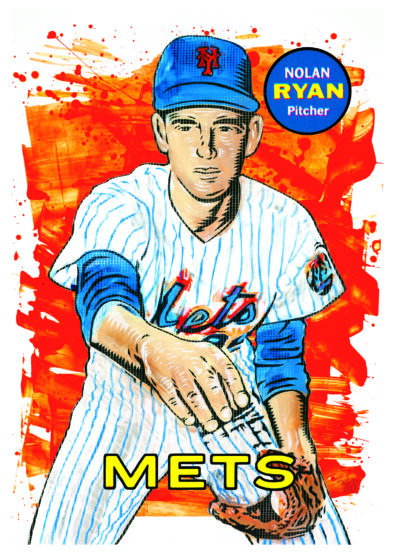
I also noticed you used – and I don’t know the term – but some of the “dots” that I used to see in comic books or Bazooka Joe comics. Why that particular aesthetic on this card?
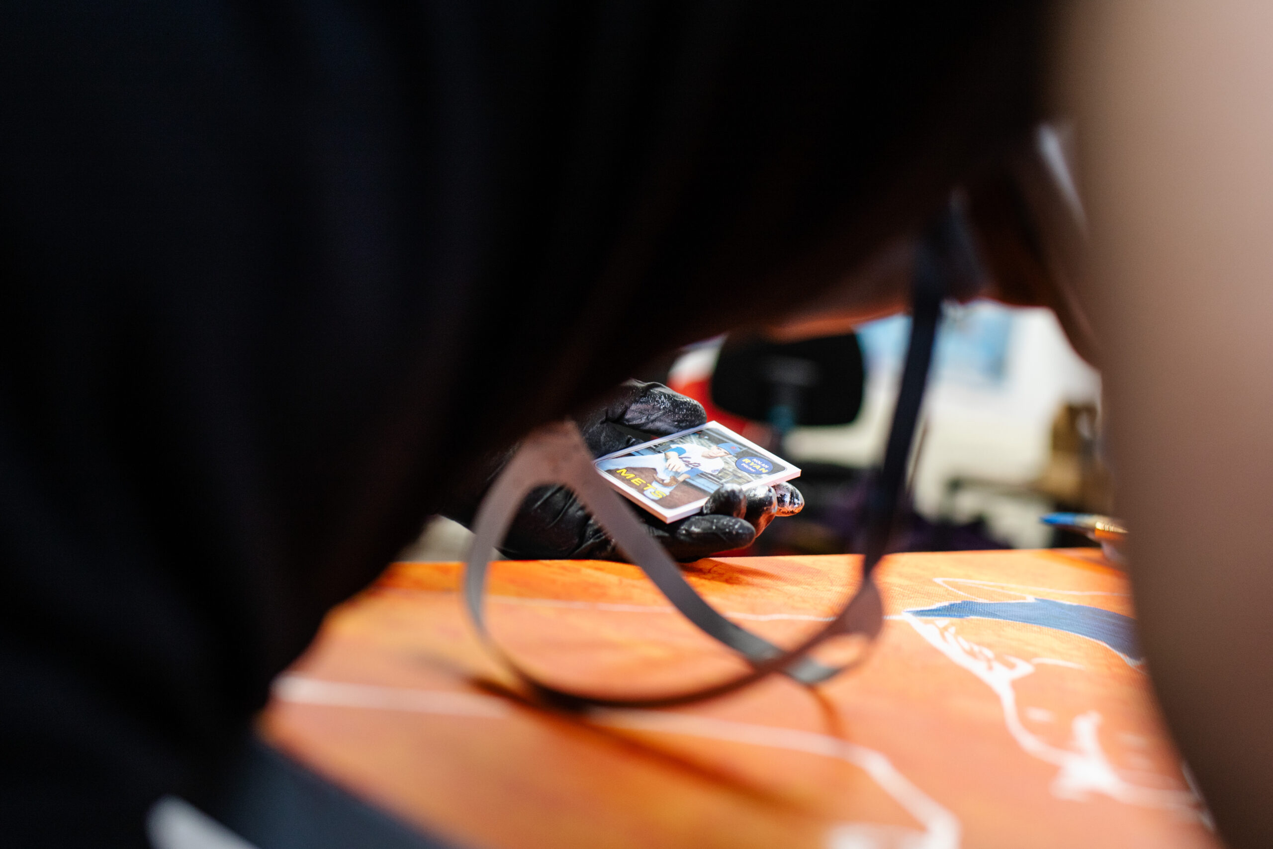
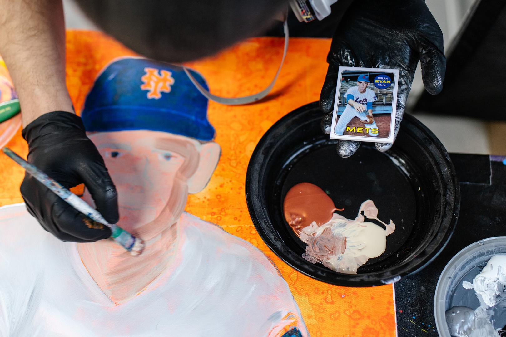
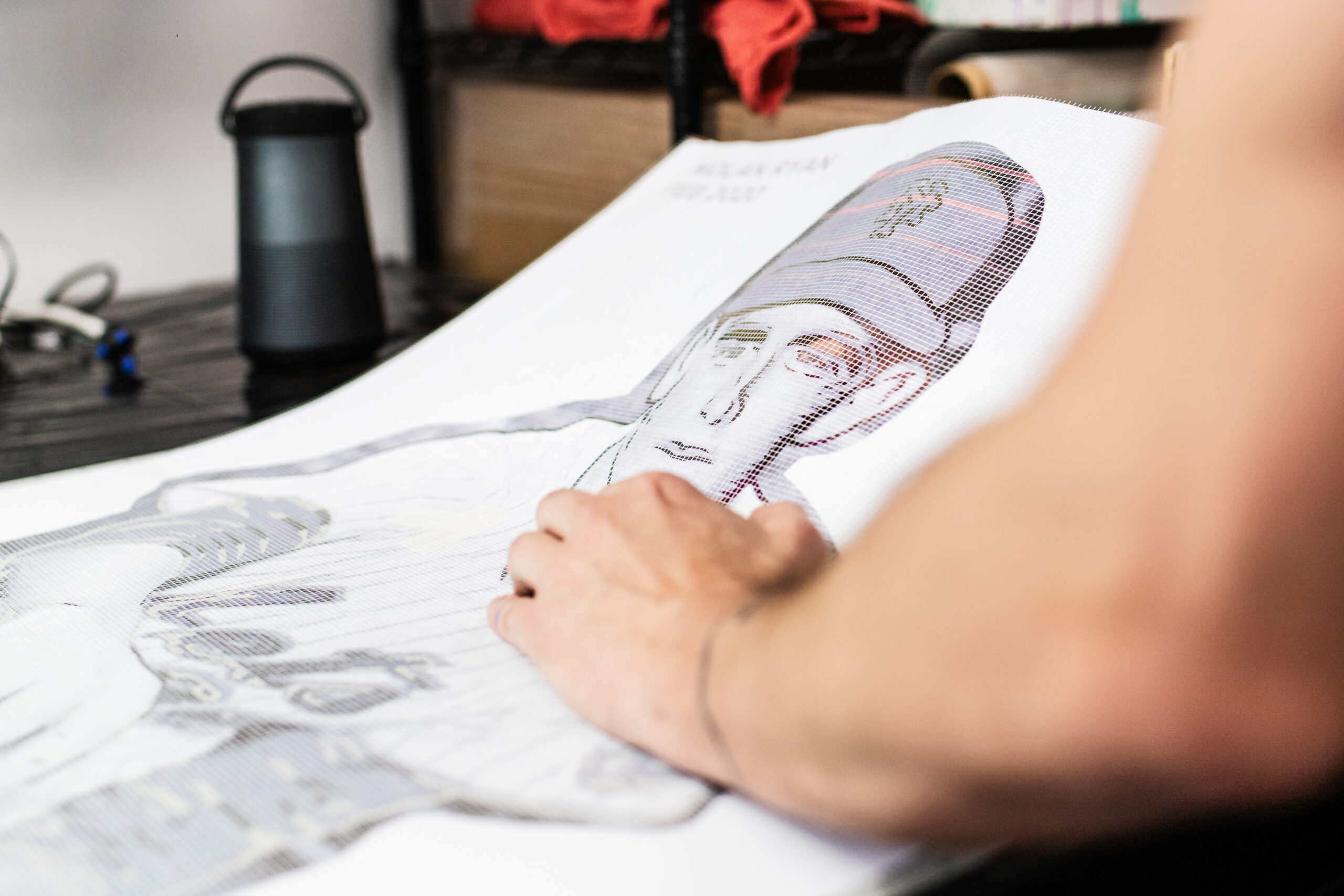
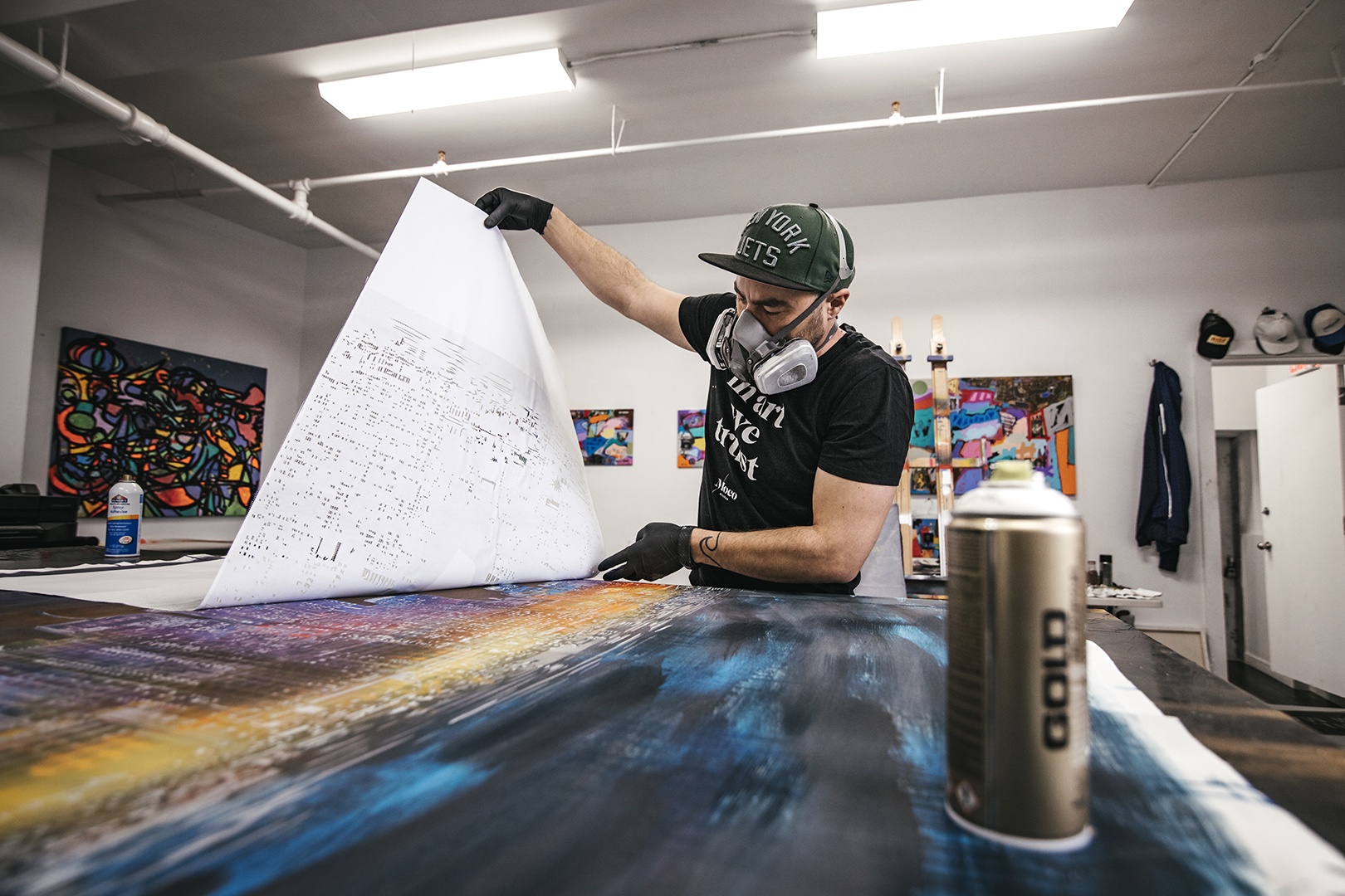
The grid pattern that appears on my work comes from the process I use to create my stencils. I cut my stencil layers by hand (many hours sitting with and x-acto blade, listening to audiobooks), and then I put a material called FibaTape on top. It’s actually construction mesh, intended for patching large areas of drywall. For me, it holds my stencils together, gives them a little more durability, and gives that cool pattern. I included a pic of me working on the Nolan Ryan stencil where you can see it a little better.
Is there a particular card in the set you’re looking forward to us all seeing?
I am excited for a bunch of the cards, but a few that comes to mind are Mark McGwire and Mike Trout. I grew up idolizing Mark McGwire, and collected all of his cards. I was back at my parents’ house a few months ago and was going through my old collection, found a few autographed cards and balls from him, so that is going to be a fun card.
I am excited for a bunch of the cards, but a few that comes to mind are Mark McGwire and Mike Trout. I grew up idolizing Mark McGwire, and collected all of his cards. I was back at my parents’ house a few months ago and was going through my old collection, found a few autographed cards and balls from him, so that is going to be a fun card.
Mike Trout is going to be awesome for a few reasons. First off, the card is pretty new, so the reference image I will be using is a lot higher resolution than some of the older cards. This gives me a little more to work with when cutting my stencils, and I think the outcome is going to be awesome.
Is there a card you wish you could have done that isn’t part of this run?
Babe Ruth would have been really fun. Besides that, I think the Topps team did a really good job selecting the players and cards to work from.
Thanks Blake and Topps! Find out more about Project 2020 here and next I will find some time to do a similar post about the Gooden card.