There is a feeling I am really starting to get. Seems to me that a lot more blue and orange is being used and less and less black in a lot of the Mets materials. I just received my 15 game plan ticket book and it looked very classic to me.
Here is the front cover of the ticket book:
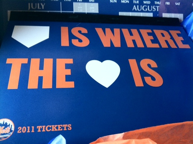
Blue,orange, and white for the slogan. I am not a fan of the slogan but everything can’t be about me. Some of you (Shannon) can nitpick about the use of the black binding if you want though.
Upon opening the book and getting to the tickets, you see:
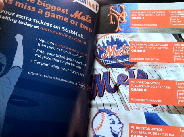
Classic looking. I like the orange box makes the text stand out more. One hat and three jerseys.Nice.
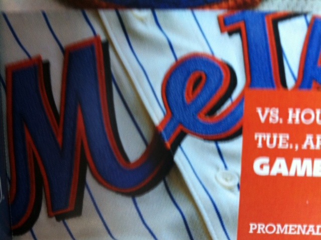
Let’s take closer look:
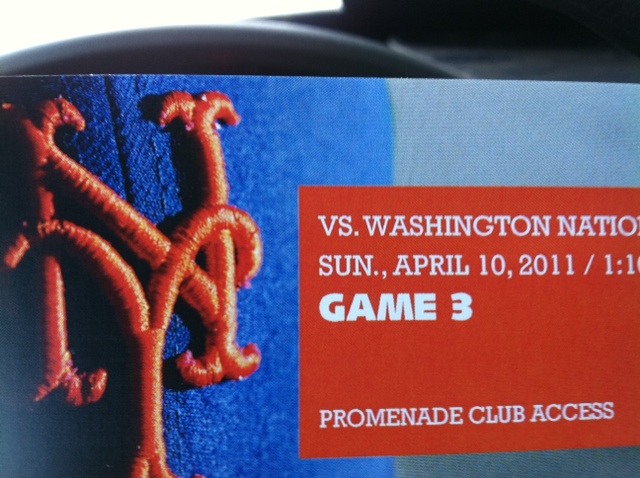
Classic blue hat. No hybrid. No all black.Just classic blue. People it might be a sign. I think it might be time for the Blue Cap Army to make a comeback.
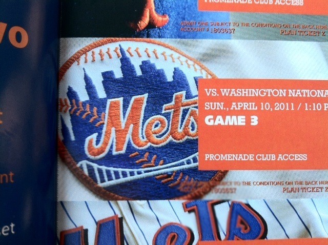
Mets patch no black in it.Looks to me like it’s the sleeve of the pinless home jerseys. Again the logo looks classic. Yes, I know Shannon it’s missing the little NY.
The cream colored home alternate jersey. Nice jersey. Black drop shadow not so nice. Only “black” included in these tickets.
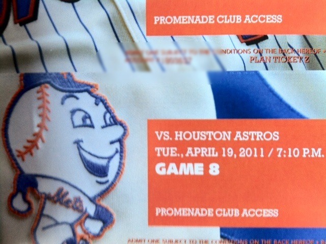
This seems to be the throwback NY jersey from a couple of years ago. Look at that smiling Mr Met that is on the sleeve of that jersey.
I might be totally wrong but it does seem that the Mets look like they are trying to build upon their tradition. I just love the look of these tickets. Mock me if you guys want, but I am having a really good feeling about the start of the regime change.It seems that it is infiltrating the whole organization with more classiness.