It seems every day this week there has been something in the paper about Dan Murphy’s defense. Â It’s a very boring topic.
Yes he looked like me in left, but I rarely remember throwing anything at my TV when he was at first base. Â Is he Keith Hernandez? Â No, but not too many are. Â Just catch everything thrown to you and that’s fine 99% of the time.
I think the bigger question about first is whether or not the team can live with 12 home runs? Â The flip-side is that Murph led the team in 2009 in that category, so it would be odd to not consider him a starter heading into 2010.
How about we just enjoy a home grown player for what he is. Â Maybe 12 home runs becomes 18, and the defense is ok. Â Unless the Padres are trading Adrian Gonzales for Luis Castillo (oh wait, the Mets didn’t sign Hudson so now Castillo needs to stay) there’s little out there that interests me, so why not Murph?
The Mets made a good move getting Keith Hernandez out there to teach. Â They should have done that years ago when they inexplicably didn’t stick Piazza at first for the full 35 games in the spring.
I know this Murph stuff fills column space, so in the end that’s really what we’re reading about. Â This week you will read 5 billion generic “can the Mets rebound from injuries?” type stories and another billion “the Mets have question marks” articles.
That’s why I appreciate the different. One blog you should regularly visit is Mets Walkoffs. Â Here’s one that thinks about where Strawberry would be in the Mets Pantheon had he not left for LA, and another that points out to you youngsters just how great Gooden was and that he’s clearly the best Mets pitcher of the last THIRTY years. Â Seaver is nice and all but think about that, the last THIRTY years.
Or what about Centerfield Maz, who also does his own thing. Â Who else would write a column about Tom Veryzer or Sherman Jones (who?).
There’s plenty of great Mets related writing out there, including the newspapers, but the same column over and over (is Reyes healthy? Â Can David Wright’s power come back? Â Will Jerry/Omar last the season?) bores me.
 Cool stuff
  I see a bit of a discussion about a proposed Mascot race at Citi.
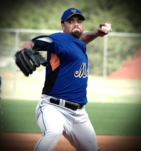 I’m kinda fried this morning, but have a few neat items to develop, just not yet. Â As the coffee kicks in let’s ponder this jersey Santana is wearing (photo from MetsBlog.)