The Mets shared a teaser for the City Connect jerseys. Note the use of the Queensboro Bridge and the purple NY.

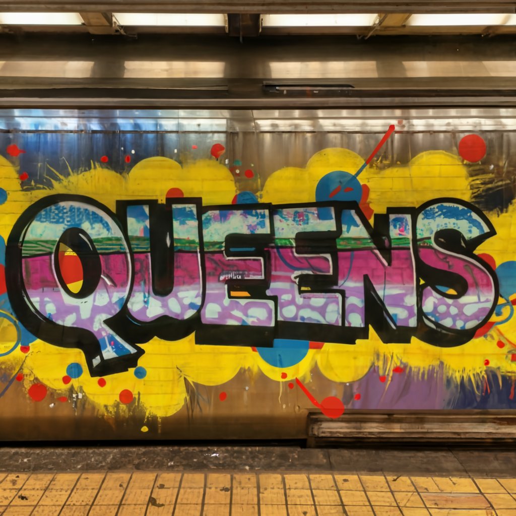
For years I have been goofing that the Mets City Connect jersey will be awful, joking that they will probably lean in on the Queens part and go with a subway graffiti font.
Well look at the purple. That’s a 7 train purple. (Maybe they just want to sell 850 of these to t-shirt enthusiasts)
And what do we think of when we think of subways in Queens?
GRAFFITTI.
Are these maniacs going to hang in purple jerseys (which MIGHT be ok) but with QUEENS in graffiti font? Oof.
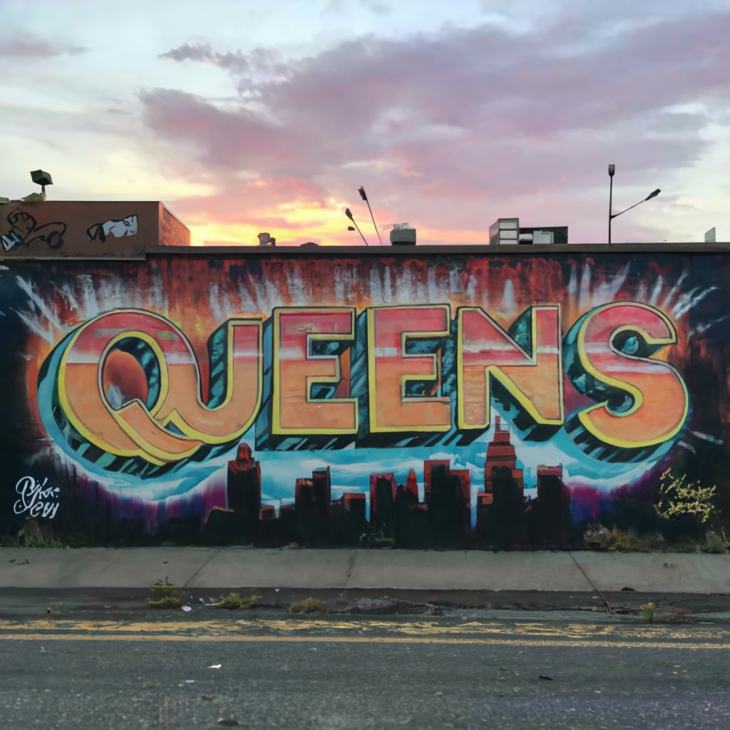
Something like this wouldn’t be atrocious (again here at Mets Police we think they should just wear the 2012 set forever.)
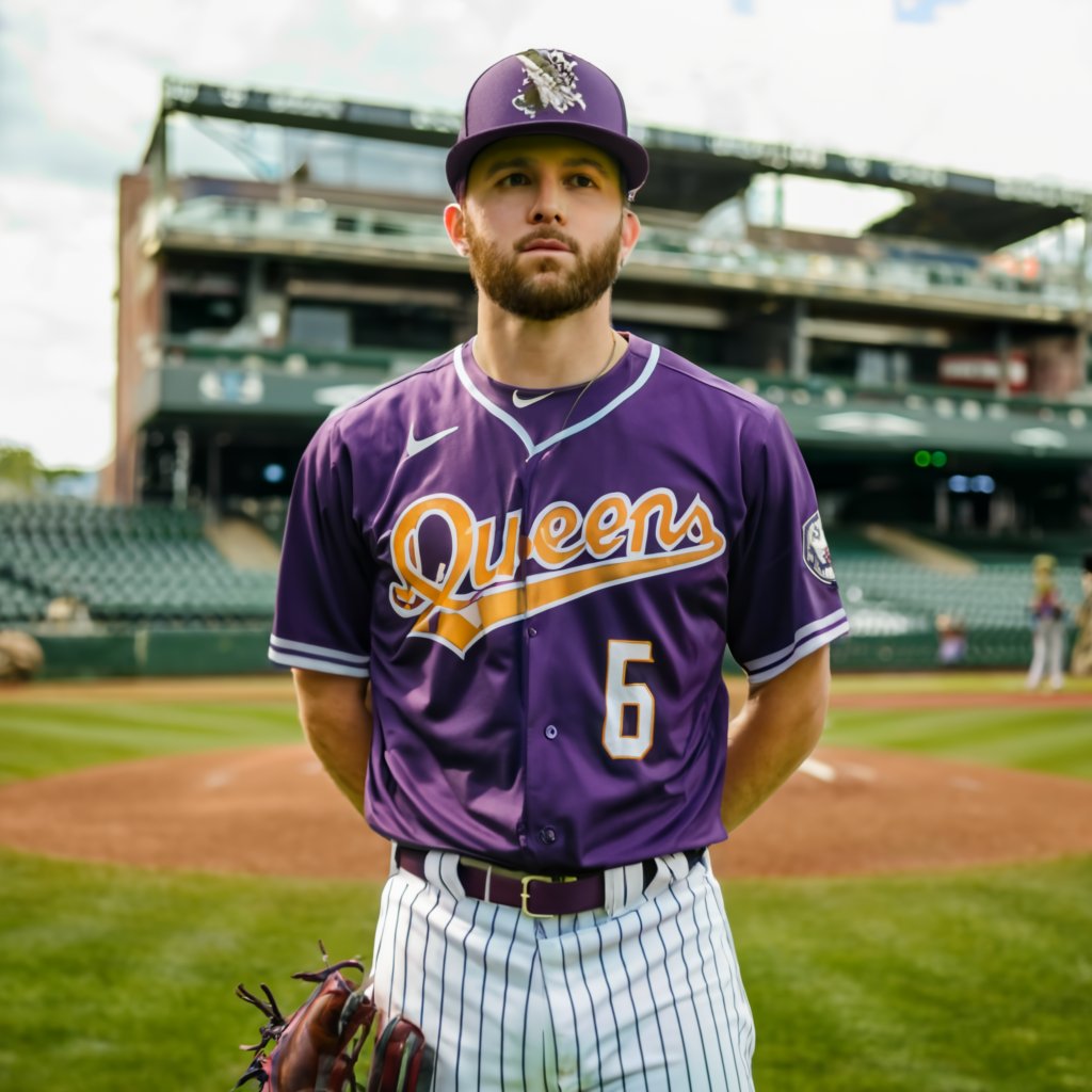
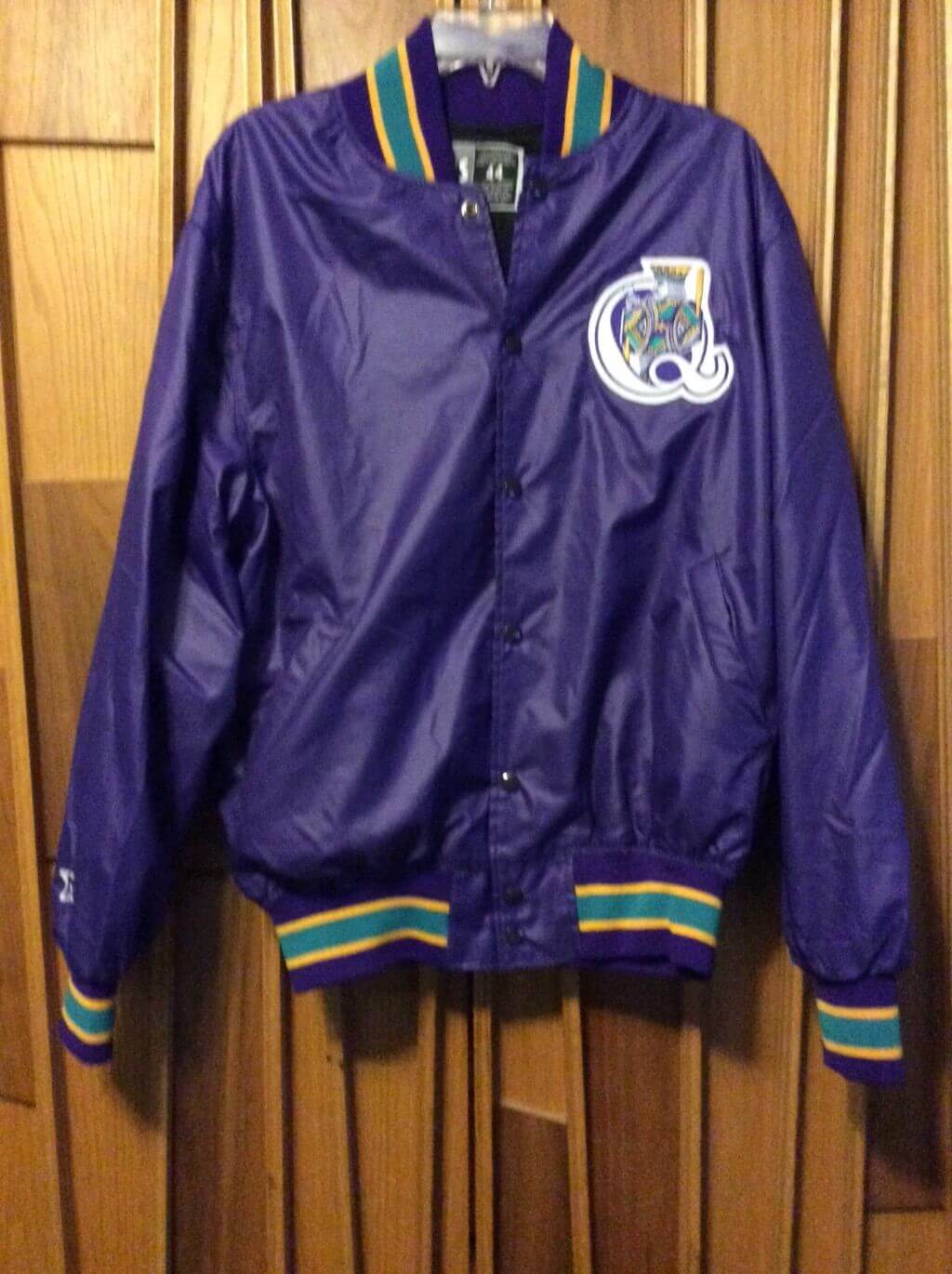
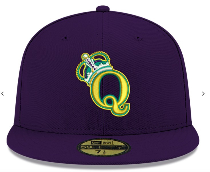
And don’t forget the Queens Kings already did purple/Queens motif…
So none of that is AWFUL, it’s not great but it’s not awful…..but what if we add GRAFFITI FONT
I can’t get the AI to generate graffiti font on a jersey but use your imagination.
I also don’t think this post below is crazy, as one of the reasons for the change in the black jersey was to match the black cap which was to match the city connect jersey. So maybe something like this isn’t off the mark….

Another clue might be the white lettering in this teaser…let’s look again
That could be some legally distinct “Subway” font.
I don’t think MLB/Mets/Fanatics/Nike/The Communist Government would spend the money to have “subway circle” custom numbers for everyone.
Also, the more I think about it, maybe Graffiti Font is hard to execute on a jersey? Easier to do individual block style letters?
I’m also not sure anyone looks at Subway Font and thinks…cool. I think it would wind up looking something like this, but purple

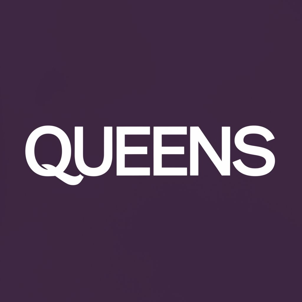
AI won’t generate it for me, but the end goal would be QUEENS in white helvitica (or legally distinct similar) font
The MTA sells these…not sure that white subway font is all that exciting.

I think the Mets should wear this on Friday night.